Why is Tony Hawk's Pro Skater 3 (THPS3) always a reference point whenever I think about designing 3D spaces in games?
A large subset of games could be described as "interactive collections of shapes imbued with meaning". Here I'm thinking broadly of "Action" games where the player is enacting some sort of real-time actions within a game world. In a 2D game, the shapes that I'm talking about are the 2D graphics/sprites/etc. In a 3D game, the shapes can be thought of both as the 3D models, and the shapes that make up the shifting 2D composition of the camera's photographic view. The relationship between shapes and their imbued meanings in a video game can act as an interesting metaphor for "real life" human perception—the way that we process the essentially infinite sense data around us into a coherent experience of reality.
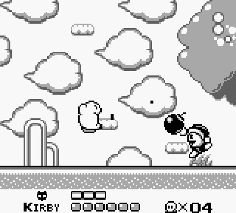
When all you have is a suck, everything looks like a snack.
What do I mean by that? Well, there is Maslow's famous quip "if all you have is a hammer, everything looks like a nail", or as Abraham Kaplan put it, "We tend to formulate our problems in such a way as to make it seem that the solutions to those problems demand precisely what we already happen to have at hand" (Law of the instrument). This mirrors the process of action game design, in which areas and obstacles are primarily designed in conversation with the player character's abilities (moveset, verbs, etc). Each person has their own strengths/weaknesses, abilities, and life experiences that guide the way they perceive the world around them—e.g. how they assign meaning to shapes. A pedestrian might see a wooded area as a pleasant walking area, a naturalist would be surrounded by detailed information about the many species, a developer might picture the money that could be made by replacing it with condos. Video games abstract systems and constrain the possibility space, which essentially allows the player to play dress-up with a drastically different set of strengths and relationships to space.
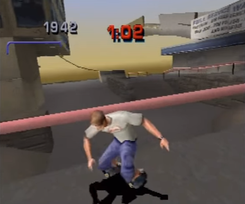
The shapes in THPS3 are incredibly communicative. It's always clear what sets of movements can be applied to every part of every object in the stage. Horizontal surfaces = manuals, Vertical walls = wallrides, sharp corners and thin lines = grinds, etc. The arrangement of those shapes plus their interactions with momentum and balance creates a fascinating spatial language. Learning the language allows you to have a conversation with the space. THPS3 would still be a good game if the shapes were just blobs of random colors, but applying a realist art direction to the (deceptively) abstracted shapes elevates the experience even further. We're not simply interpreting generalized physical space, we are RE-interpreting already familiar spaces (an airport, a neighborhood, etc) via a new body/language. Careful modulation of various kinds of abstraction can have a huge impact on the experience of play. For example: if the level shapes were more realistic (more complex, and less "biased" towards their function as skate park) or if basic moves like the ollie required difficult inputs, then the experience would offer a less metaphorical perceptual lens—it would be more similar to YOU the player learning how to skate IRL. As it is, THPS3 presents to you how it might feel to be a superhuman skate creature who sees the world exclusively through the lens of sick combos.
Now let's look at how this thinking applies to some different games and perhaps has a lot to do with my personal tastes and preferences.
Zelda 2 vs. 3D Zeldas
The "Z-targeting" system from Ocarina of Time (the first 3D Zelda game) was very influential and has left a heavy imprint upon 3D action games to this day (I'm not sure if it was actually the first game to do this, but I've heard it credited as popularizing it). Essentially, you lock onto an enemy and from that point forward you stay facing them even as you walk around. Designing 3D camera systems for action combat can be a pretty tricky task, and these lock-on systems have the immediate benefit of making the player feel extremely in control of their position relative to the targeted enemy (however their relationship to other enemies and the terrain is still tricky).
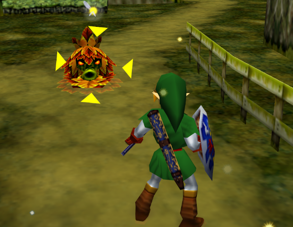
Despite the value of the Z-targeting idea, I think it's a shame how influential it's become, given that it's only one of many potential ways to create 3D action in a 3rd-person view. Locking on creates a sort of pseudo 2D game, because the constant line between the player and enemy makes it similar to existing on a flat plane—almost like playing a fighting game from rear view. But the thing is, fighting games are rarely played from the rear view, specifically because you can't see as clearly with the player facing away from the camera and often blocking the enemy. So you end up having to account for that, with a big focus on enemy windups telegraphing their moves, shields, dodge rolls, etc (more on this later). People do pretty fancy stuff with combat in Breath of the Wild, but personally 3D Zelda combat has never really clicked for me.
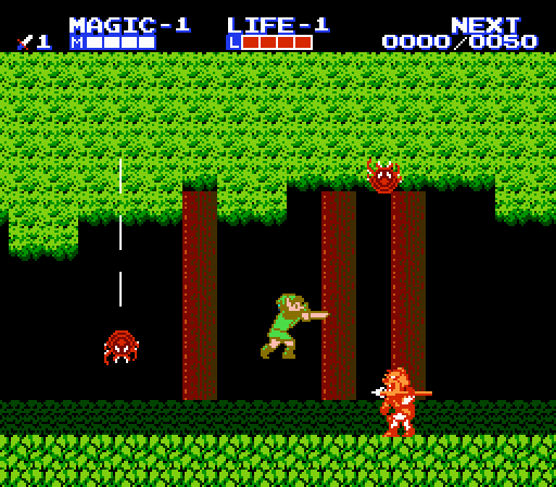
I was really shocked when I played Zelda 2 several years ago at how precise and subtle the combat was. Because of the clear side-view and simple shapes, there is a high resonance between the visible shapes and the meaning ascribed to them, allowing the player to react very quickly and intentionally. It strikes me as an example of a scenario in which the assumed "more advanced versions" simply have different priorities with significant strengths and weaknesses.
Fighting Games
Growing up, I didn't really understand the concept of hitboxes and so my brain always had a sort of uncomfortable loose end when I tried to parse fighting game mechanics. You can sorta tell from playing that the exact pixels of a foot in a sprite aren't necessarily determining whether a kick lands. But I had no idea that the colliders were generally rectangles and frequently very divergent from the sprite. My perception of fighting games is that in some ways they are like 2 different games depending on if you are familiar with the hitboxes. If you are, then you can visualize the hitboxes behind the sprites, but if you aren't, then it's almost a superstitious experience trying to understand how the game's graphics will relate to what happens.
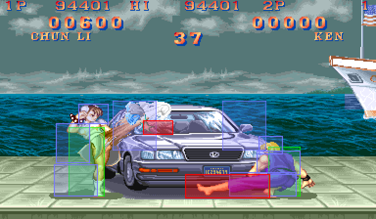
Image courtesy of secrets blog
Compare this with THPS3, where most of the time the colliders and the visible models are one and the same (at least that certainly seems to be the case). This is not to say that fighting games are worse or wrong for using this method which obviously has a lot of benefits. But I think it's an interesting contrast to think about.
Dark Souls
Dark Souls relies heavily on the lock-on targeting mentioned above. However there are a few select bosses/moments where locking on is a detriment, and then you often have to contort your hands into some ridiculous claw formation to be able to get the camera angles right.
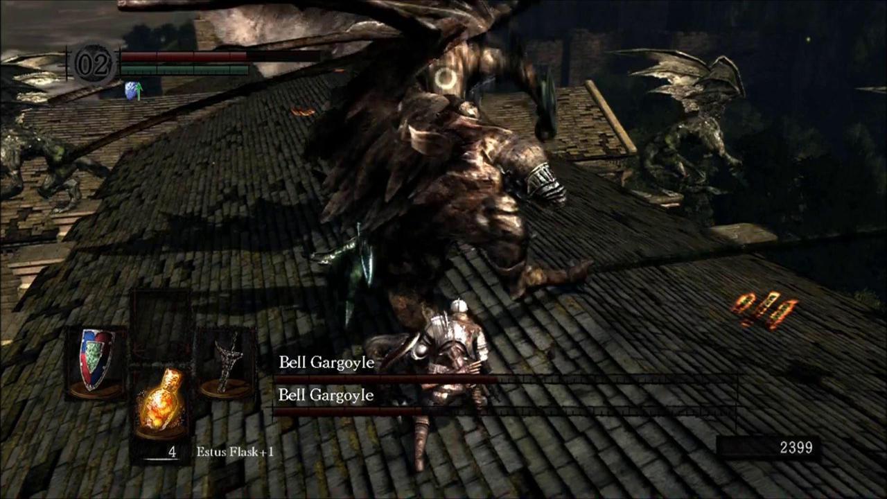
Overall Dark Souls bears a heavy shape/meaning dissonance. A big part of the challenge in battle is being unsure about hitboxes, as bosses have complex shapes and angles and there are many player weapons of varying size and shape. The physics of terrain slopes/falling are also unpredictable and unforgiving. There are certain abilities that try to counterbalance this shape-messiness. For instance, while doing a dodge roll you have a certain number of "invincibility frames", a part of the rolling animation during which you are immune to all attack damage. So if a boss with a giant, irregular claw takes a swipe at you, simply hitting the roll button at the right time will ensure your safety, even if visibly the claw hits you. I didn't know this on my first attempted playthrough (because it doesn't really make intuitive sense), so I played more spatially conservatively than necessary (and got stuck in Blighttown).
Again it's not wrong per se for the experience that they're going for with Dark Souls, but personally I don't love this degree of dissonance. Similar with fighting games, it's like there's this very common but unexplained secret meta information that totally changes the game, which is kinda odd to consider.
Shadow of the Colossus
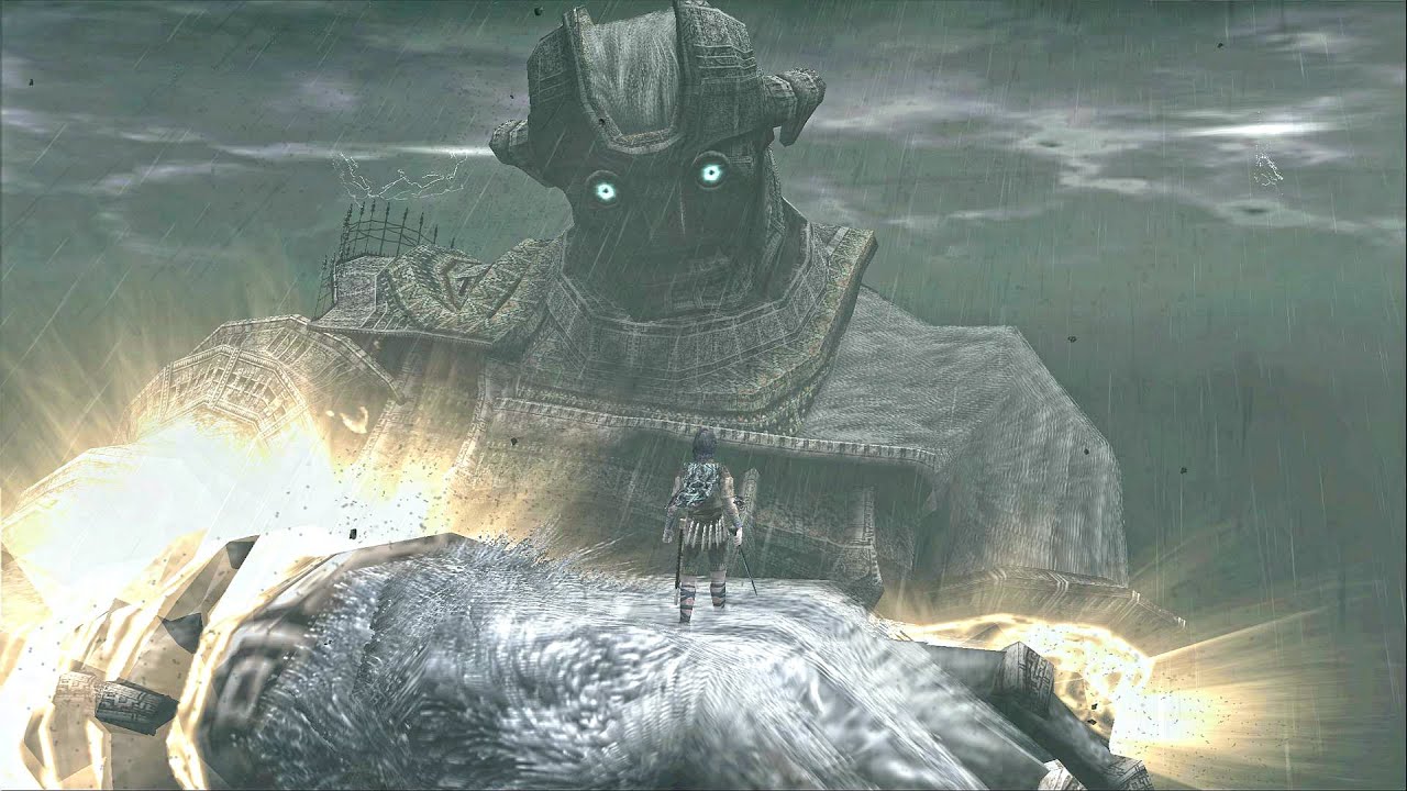
I really like the shape-meaning resonance in SotC. The Colossi themselves are very meaning-shapey—as their bodies bend and flex, walls may become floors, safe spots may become dangerous, etc. The player character Wander reacts predictably to gravity, walking around if the surface is level and falling if it gets too steep. They can grab onto ledges or fur to keep from falling. The really lovely way this is explored is that the Colossi are also bodies that function in ways that we can relate to as body-havers (falling to one knee, smashing with an arm, shaking a head). While climbing on the Colossi, we can predict the ways that the angles will morph around us AND how we will respond to those angles because we are relating to the bodies of both the Colossi and Wander simultaneously.
Witcher 3
One of the big reasons that I'm enemies with this game is that it feels very careless about shape-meaning resonance. The game places a high premium on Big World and AAA allover detail realism, and these come at the expense of crafting a physical-mechanical meaning from how spaces are shaped and how objects look. When the spaces are so large and all scenes/objects are handled similarly, the player can't be expected to actually find anything. Because so little functional meaning is carried by the primary shapes (the main art of the game's world) this meaning must be bluntly appended via secondary sets of shapes (the "Witcher vision" and minimap). In real life, when you learn more about things in the world around you, you see them more, you are more present with them. Walking through the park, a birder may be surrounded by friends, while another person might barely notice the sights and sounds. A crowd of strangers is more dim and indistinguishable than a group of loved ones. Witcher vision communicates the opposite: that knowledge and understanding flatten and shrink the world, making it cold, simple, and binaristic.
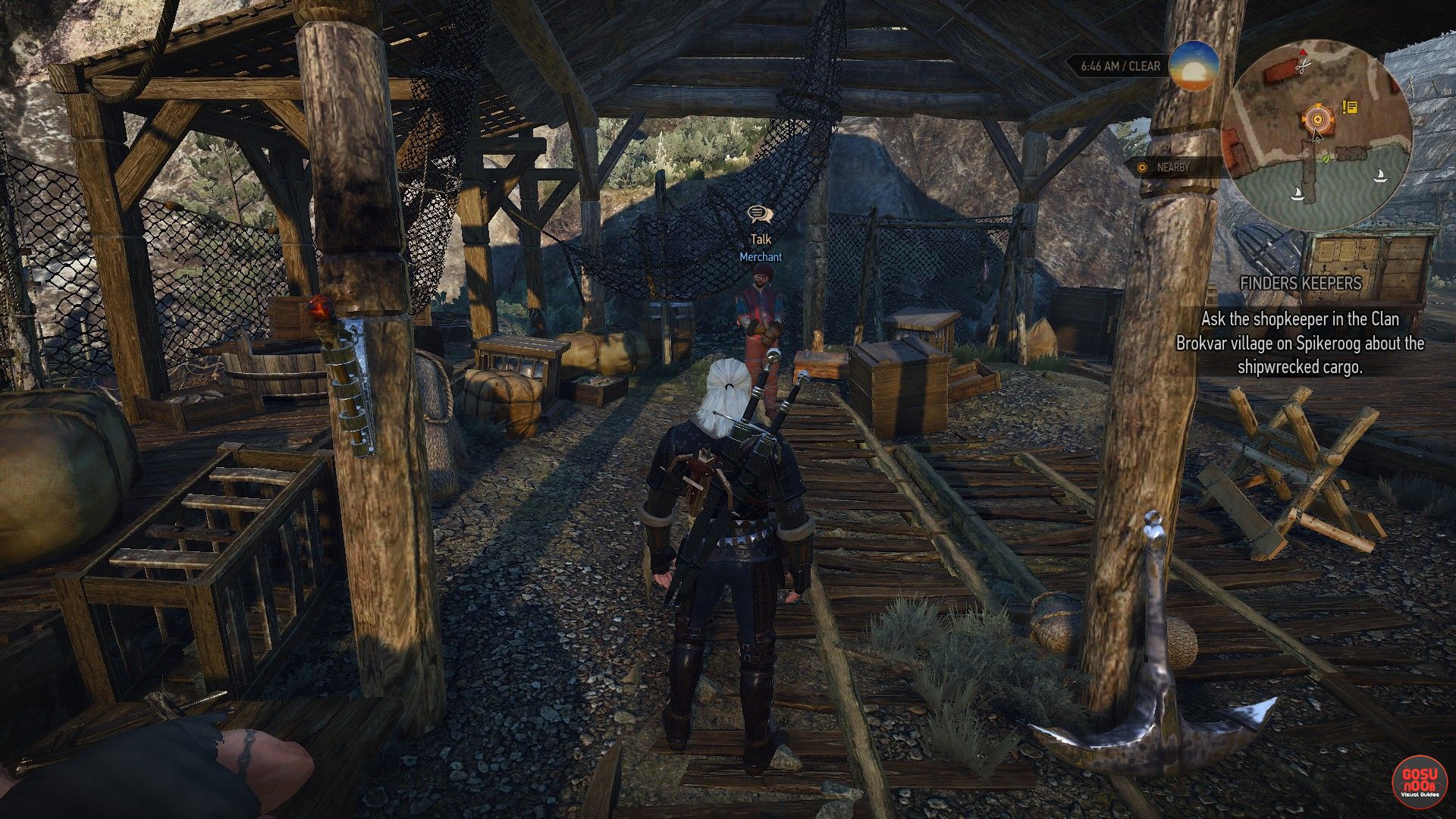
The primary art direction could be informed by the way the Witcher Geralt might interpret the world, what things would stick out to him, his depth of knowledge of land, plants, investigation, etc. This is entirely possible to do within a realist art style, but it takes a lot more consideration than scattering hi-def assets everywhere and then adding a "tell me what to do next" button. Playing this game just felt like a giant list of pedantic instructions, not like a concerted communication of how a Witcher might be.
X-Wing Series
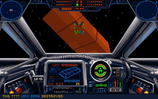
But just because I'd prefer the Witcher's presentation to be more unified, doesn't mean that's the "correct" way. The X-Wing series is thrilling specifically for the way it divides information. You can look out the windshield and understand some of the situation, but there are very few visual cues in space to help you gauge scale. To really have a clear idea of where your target is, you must synthesize the information from your directional radars, console distance reading, and windshield view all together. This process is designed to communicate specific qualities of how a starfighter pilot might think and exist.
Conclusion
I think there's a huge amount of potential in the realm of 3D action games, and Melos and I are definitely tapping into that in different ways with our current project S and our next project C(?). Conceptually I really love that action games can create absurdly "biased" world in which everything that exists was created with the specific attributes of the player character in mind. It's really funny for one thing, but I also think it's fascinating how we just take to it, how there's this strange plasticity that allows our brains to just accept these absurd unreal worlds with their own sets of rules and to assume a sort of narrative transferrence between those worlds and ours. By inhabiting biased lenses drastically different than our own, we can perhaps gain perspective on our biases and how we formulate the problems and tasks that make up our lives.
Thanks for reading! Incidentally, back in 2013 I made a game called Secrets Agent, which is in part a commentary on games' bias towards players. In Secrets Agent, the solutions to puzzles are very arbitrary and essentially impossible to "solve". The game only functions because there is a voice telling you exactly what to do at each point.